
A lot has been written in the last year about the whys and hows of icon fonts. The field has been well-explored and documented. We now find ourselves with no shortage of well-designed, free/libre and paid icons sets and some fairly standard ways of implementing them.
Although it's easy to get going with something like FontAwesome or half a dozen others, there are some situations in which we might need to make our own:
- Our design calls for a unique icon;
- Our project is open source, and there are no options with compatible licensing.
If you do need to build your own icon font for these or other reasons â or if you just want to try your hand at the task â there are plenty of resources available. For creating icon artwork, we have familiar tools like Illustrator or Inkscape. For converting the final outlines into actual fonts, the easiest solution is probably the IcoMoon web app, although dedicated font software like Glyphs are an option if you're already familiar with engineering typefaces. There are also plenty of good tutorials on the general how-to.
So instead of doing a comprehensive tutorial covering the same ground, I thought Iâd do a quick post about some of the finer considerations of designing icon fonts for day-to-day UI work.
Scale and Alignment with Text
Even some of the best icon fonts out there sometimes look the wrong size when used alongside text.
If you're designing icons from scratch, it's helpful to design not only against your chosen pixel grid (often 16px), but also against a representative font â either the one you're using in your design or a font optimized for UI work (hopefully those two aren't mutually exclusive).
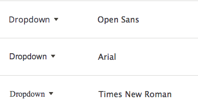
Ensure your icons are aligned correctly relative to the baseline and ascender line of the type, and scaled appropriately. Most icons should sit on the baseline, just like standard letters, and not rise above the tops of lowercase letters like âbâ and âhâ. Unusually-shaped icons can sometimes deviate, either peeking beyond these boundaries or â like the dropdown arrow above â sit within them, but most icons will work best when scaled this way.

Keep in mind that font metrics matter: the shape of the letterforms, especially the x-height, will affect how your icon font sets with your text. For most applications this shouldn't be an issue, since most typefaces well-suited to UI work have similar metrics.
Optical Size
If you design all icons to fill the exact same area (say 16 à 16), invariably some will appear bigger than others to the eye. This apparent variation in size has to do with the surface area of the icon, which depends on its shape. Icons that take up a lot of room, especially with large fill areas, have a larger optical size, which needs to be compensated for. The amount of compensation isn't an exact science in practice â practice and good judgement are needed â but the range is usually ± 12%. For common shapes, such as reversed shapes on a filled disc, ensure size adjustments are consistent.
Antialiasing
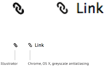
Don't trust the antialiasing in your graphics app of choice: it may or may not match (at all) the end result in browsers. Consider previewing your icon artwork in the browser to gauge your work, at least until you become familiar with how shapes tend to render "in real life". At the very least, trust the actual shapes as-drawn (by zooming in to see detail) over the 1:1 scale preview.
Sweat it to forget it
Using icon fonts these days is easy, and they're a great option for scalable, reliable icons for UI. If you need to (or want to) make your own, the tools and techniques are now almost as accessible. If you do invest the time to make your own icon font, it pays to mind the details â your icons will look great and for as long as you need them, they'll just work.