Our Designs Work Hard.

Elevate Your Online Presence
Responsive Web Design
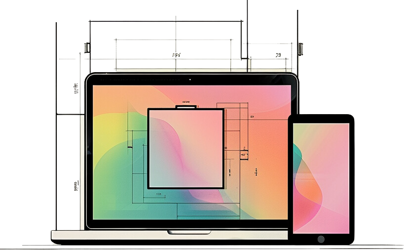
One website designed with everyone in mind. With mobile traffic now eclipsing desktop traffic, mobile users can not be an afterthought. With our mobile-first approach to design, we ensure the fastest-growing user base is served an experience that satisfies your business objectives without compromise.
Wireframes
You wouldn’t start building a house without a blueprint. The same holds true for websites and applications. After we establish the information architecture we create visual representations of data and components that make up the web pages and interface. Being low-fidelity sketches, wireframes allow us to quickly iterate and produce a functional blueprint for the website.
Website Prototypes
When wireframes and mockups aren’t enough to test a user’s flow through your site we create prototypes. Leveraging best-of-breed prototyping tools, we test the intent and success of our designs and user interactions.


